As part of the Securities and Exchange Organization website redesign, I was poking around websites like https://www.sca.gov.ae and I came across a common UX oversight.
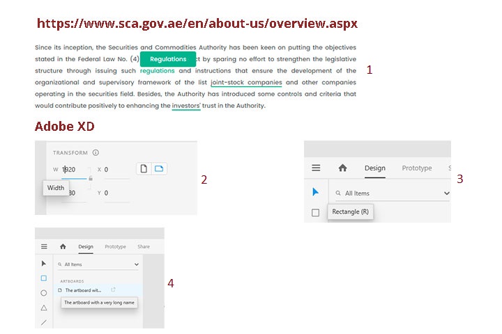
Hovering over terms like "regulations" surfaced a tooltip that merely repeated the word without offering further details, as shown in section 1 of the image above. This is a common misuse of tooltips.
Tooltips should be used to provide secondary information. They could help avoid clutter and conserve screen space. They are particularly helpful to users who require additional information without annoying those who do not.
Adobe XD UI, on the other hand, demonstrates how tooltips could be used effectively. Here are some examples:
1. As shown in section 2 of the figure above, the word “Width” is displayed to users with a well-timed lag after they hover on “W” and keep their cursors on it for a few seconds.
2. As shown in section 3 of the figure above, hiding labels, like “Rectangle”, in tooltips and displaying them to users only after they hover over icons helps keep the screen less cluttered.
3. As shown in section 4 of the figure above, when the full name of an artboard exceeds a certain number of characters, only the first few characters are displayed in the left pane along with an ellipsis icon. Hovering over either the shorthand name or the ellipsis icon then leads to the display of the artboard's full name in the tooltip.
March 23, 2021 at 8:09 am
that’s great!