This story addresses the problem of overusing modals in UX design by drawing designers’ attention to all tools they have in their toolbox in addition to modals.
Modals are overused on the web today. Looking closely at their use cases, it is easy to realize that there are misconceptions among designers around their proper application.
Modals are a strongly discouraged UX pattern. By design, modals interrupt a user’s workflow. When a modal is active on a page, the user is blocked from interacting with the content on its parent page and cannot return to their previous workflow unless the modal task is completed or the user dismisses the modal. While modals could be effective when used correctly, they should be used judiciously to limit workflow disruption.
Modals grab users’ immediate attention. They are meant to be bold and should be reserved for cases that deserve users’ undivided attention.
I conducted a UX Audit of the unauthenticated space of a public website and found that the misuse of modals on this website is particularly widespread.
I used the Double Diamond Model of Design for this investigation. Using this framework, I was able to identify both a problem statement and its holistic solution. The problem statement pivots around the overuse of modals on this website. The holistic solution has many parts including a Modals Decision Framework (MDF) that 1. informs designers about the alternatives to modals, and 2. guides them towards the correct use cases for modals.
To keep the audited website anonymous, I haven’t included screencaps from that website in this story. To provide context and examples around the points mentioned in this story, my collaborators and I crafted wireframes in Figma mostly around ecommerce and SaaS concepts. We used Lorem ipsum whenever the copy did not play a role in the point being made in the story.
Problem space — divergence
When going through the divergence phase of the problem space, I gathered some sporadic observations.
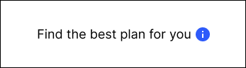
- There is an overabundant use of the information icon (i) on the website both to access modals and pop-up tips.
- Modals on the site are used to offer various types of content including textual and video.
- Modals are used to declutter interfaces when other means of progressive disclosure such as accordions are more appropriate.
- In many cases modals on this site are content-heavy and are being used in lieu of full page designs. When asked, the design team reported that their clients had a tendency to provide verbose content and steer UX designers towards cramming that content into modals. To accommodate lengthy content, many modals on this site have vertical scrollbars.
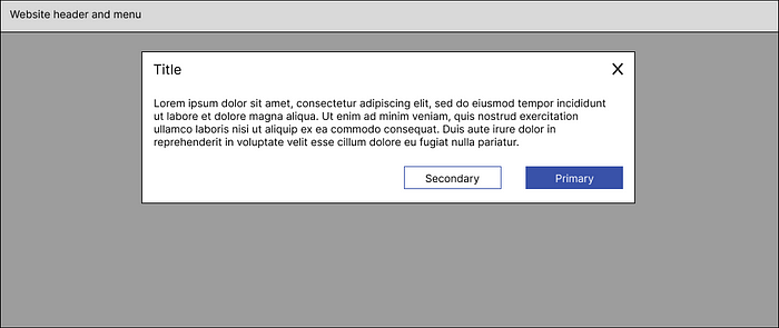
- Some modals on the site do not follow the standard anatomy outlined for modals in UX literature. This anatomy is illustrated in Figure 2.
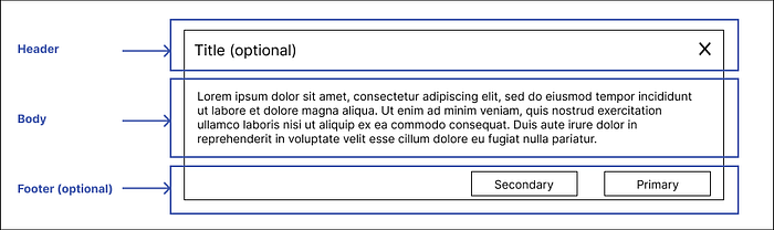
Some modals on the audited site do not follow this anatomy by:
- Burdening users with lengthy content without clear titles to put the information in context.
- Placing CTAs somewhere within their bodies rather than their footers.
- When copying the content from some of the sites’ modals into a Google search, the relevant modals appear in search results, sometimes with a higher ranking compared to their parent page.
- This website uses modals considerably more than any of its major business competitors.
Problem space — convergence
Putting all these observations together, I converged on the problem statement “User-initiated modals are being overly and poorly used on this website.” At one point, more than 1,700 user-initiated modals were identified on the audited website.
I also realized that the modals on this site differ from one another in terms of visual and content design, their SEO properties and how they are developed.
Why is the overuse of user-initiated modals on a site a problem?
I explored this problem from three perspectives: UX, SEO and content strategy.
UX
Based on UX best practices, modals are purposefully interruptive and should be used sparingly. Here are some problems caused by modals from a UX perspective:
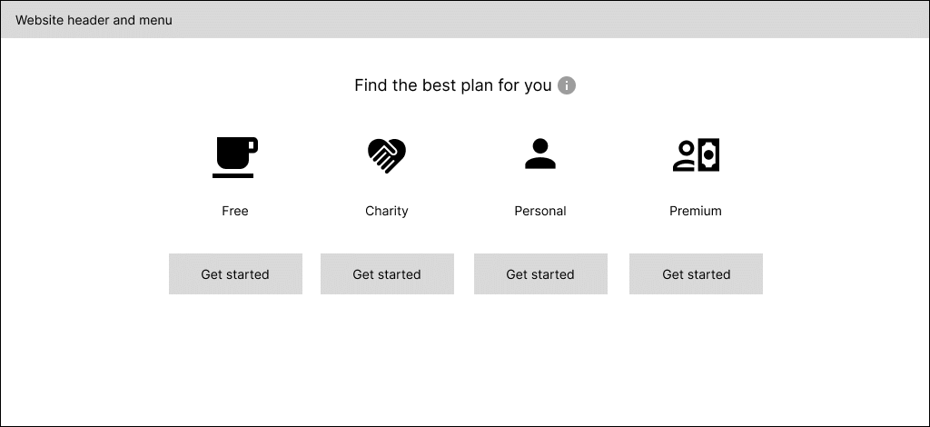
- Compared to on-page content, modals on this site often hide essential details users need to complete their tasks. An example is hiding the details of subscription plans in a modal that pops up only after users click on the (i) icon as shown in the following GIF. This could negatively affect conversion especially if that content is critical to users’ decision-making processes.
- Compared to on-page content, users need an extra click to access content offered in modals and this slows them down and could negatively affect conversion. The GIF above shows an example of this.
- Modals are rendered as overlays, so users cannot easily look at the content of the modal and the parent page at the same time. This limitation becomes especially problematic when modals are used to provide further explanation about a specific term on a page. Pop-up tips on the other hand allow users to look at the content inside them and the parent page at the same time, offering a better alternative for this sort of contextual help. Figure 4 is an example of misusing modals to elaborate on an acronym.
- Users cannot look at the content presented in two modals in parallel. For example, details of different programs should not be put inside modals as this takes away a user’s ability to look at multiple options simultaneously and compare them. The following GIF shows an example of misusing modals for this purpose.

- Modals by design don’t have standalone shareable URLs accessible by users. If a user finds the information in a modal useful and wants to share it with someone else, they have to share the URL of the parent page and then provide instructions on how to access the modal from the parent page. Figure 5 shows a use case where this limitation of modals makes it hard for users to share information. Another constraint is that users cannot bookmark modals.
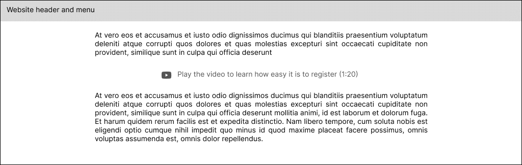
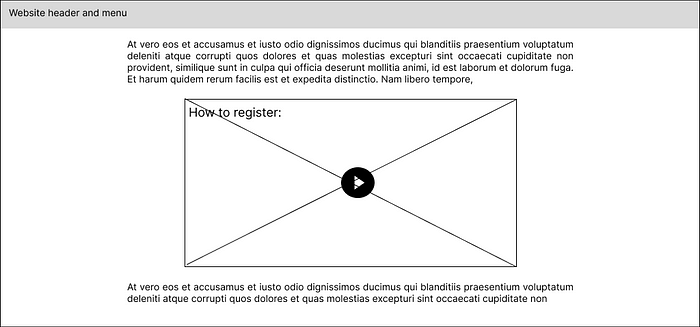
- Modals on the site are often used for playing videos that have a play button on the parent page. Figure 6 shows an example of this. Unintended clicks outside these modals on the parent page while the video is being played could lead to users losing their place in the video and having to play it from the beginning. On a side note, unlike videos, images are discrete and consume less bandwidth. So, using a modal to display an enlarged version of an image would not impede users the same way.
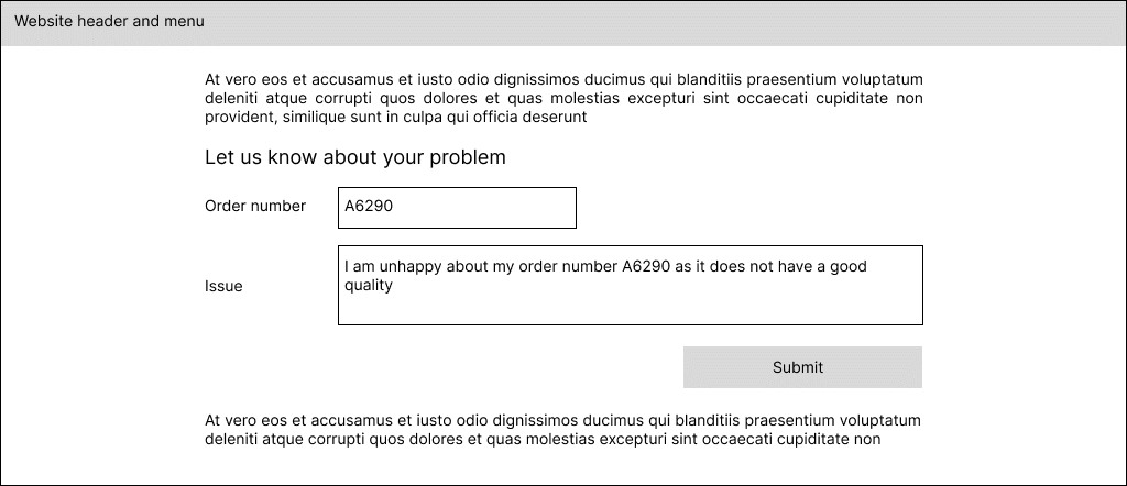
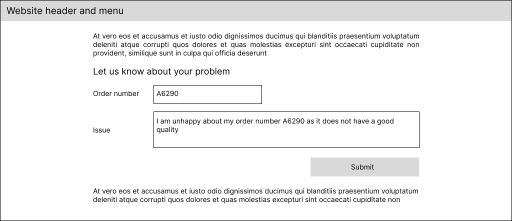
- Modals on the site are sometimes used to display information critical to users such as order/request numbers after they fill in forms and submit them. Figure 7 shows an example of this scenario. Users might accidentally close these modals by clicking somewhere outside them on the parent page or through misclicks on their close buttons. If this happens, users have lost the chance of seeing these critical pieces of information and do not have a way of accessing them again. Also, users tend to close modals without reading them and this further increases their chance of losing access to critical information in such cases.
SEO
The SEO properties of modals on this site have been set in two ways, both of which are detrimental:
- Non-searchable modals that have no-index and/or no-follow as their SEO properties: When the modals’ SEO properties are set this way, the website is losing the SEO benefits that the content in modals could otherwise provide.
- Searchable modals: When the modals’ SEO properties are set this way, traffic from a Google search will be directed to non-branded, dead-end, out-of-context pages.
These pages are considered non-branded since, unlike full-page designs, they do not have branded footers and headers.
Missing headers and footers would also mean that there is no way for users to navigate from these pages to others on the site. In addition, the absence of CTAs on a majority of these pages make them more of a dead-end as there is no next action for users to take.
Also, by offering users direct access to these user-initiated modals in SERP, they would not have the context offered on the modals’ parent pages and would miss out on the steps they would have had to take on the site to arrive at these modals. In other words, these modals were designed to be part of a task flow and so it does not make sense for users to access them directly.
An example was a modal that appeared in SERP when I did a branded Google search on the name of one of the forms on the audited site. The content of this modal acknowledged that the user’s request was received and thanked them for it. It also mentioned how the business might respond to the received request. This example clearly demonstrates the problem. User-initiated modals are meant to be displayed to users after they have gone through a couple of steps and seem random when access to them is provided this way in SERP.
These modals appear in SERP because in the development method used for this website, they are standalone pages with their own URLs in the backend and their SEO properties have been set such that they are searchable.
Content strategy
From a content strategy perspective, thinking of modals as drawers that can be used to hide content can have unintended consequences.
- Modals might replicate content that already exists elsewhere on the site. This becomes especially problematic from a maintenance perspective when modals contain business logic such as eligibility requirements that change over time and need to be updated in multiple modals. The following GIF shows an example of this.

- Modals can be used as an excuse not to trim down content and not to use more user-friendly, concise language.
- Modals can also be abused to compensate for poorly-written and unclear language on pages. The copy on each page should be clear enough that it does not need further clarification via modals. The following GIF shows an example of this.
Solution space — divergence
During the divergence phase of the solution space, I had to deepen my understanding of when and how user-initiated modals are being used on the site today. I also had to examine the alternatives to modals currently in use on the site. These alternatives could substitute for modals and provide a better user experience.
First, I looked at how modals are being used on the site today and categorized their use cases into the following buckets:
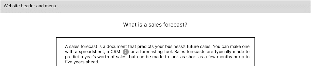
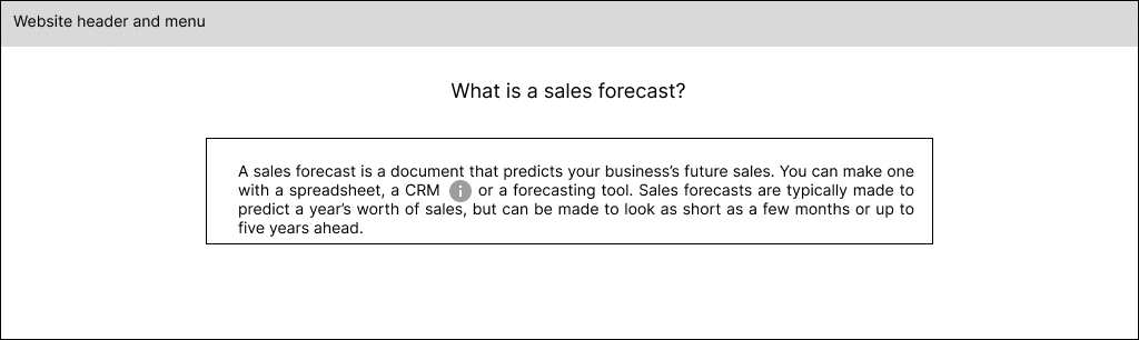
- Modals that are used to offer clarification, further detail or explanations about a topic on the parent page. This is the primary use case for modals on the audited site. These modals contain information and in some cases CTAs. I will refer to them as Basic Modals.The modal in Figure 3 is an example.
- Modals that are being used for playing videos. I will refer to them as Video Modals.An example is the modal in Figure 6.
- Modals that provide feedback to users after they submit forms. I will refer to these as Form Submission Feedback Modals.An example is the modal in Figure 7.
Second, I explored the alternatives to modals in use on the audited site today and identified the following:
Alternatives to Basic Modals:
- Placing content directly on the page
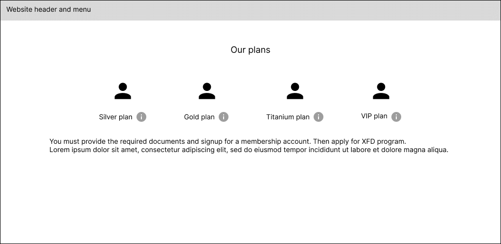
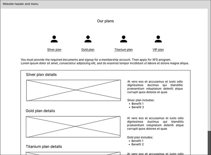
Place additional content directly on the page to avoid the unnecessary use of modals. This might require editing the additional content and rethinking its placement on the page since it must be placed where it fits best contextually. Consider the use case of showing details of various plans. Figure 10.a uses a separate modal to show the detail of each plan and Figure 10.b shows plan details on the same page.
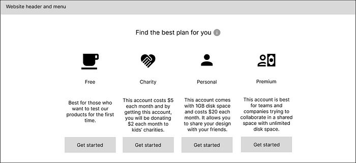
As an alternative to the modal in Figure 3, Figure 11 shows an example where the need for a modal is eliminated by providing explanatory information relevant to users’ decision-making processes directly on the page.
As an alternative to the modal in Figure 9, Figure 12 shows an example where the need for a modal is eliminated by using clear language on the page.
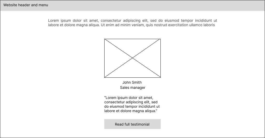
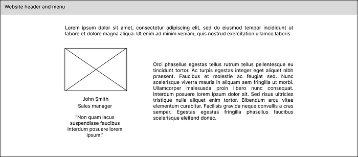
Testimonials are another common use case for modals. It is common for designers to pull out a quote from a testimonial and place it on the page while inserting the complete testimonial in a modal. Figure 13.a shows an example of using a testimonial modal. While this could work especially if there are multiple testimonials on a page, there is an alternative. Figure 13.b shows the alternative approach of trimming testimonial content and placing it directly on the page, making it more likely to be seen by users.
2. Linking to content on another page
A link could take users from the current page to explanatory content that:
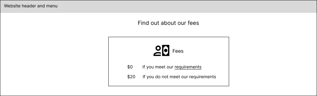
A. May be present on an existing page in other sections of the website, especially in generic sections such as articles, glossaries and FAQs. Consider the use case of spelling out eligibility requirements. Figure 8 uses a modal for this purpose. However, the design in Figure 14 links to existing content on eligibility requirements on another page in generic sections of the site.
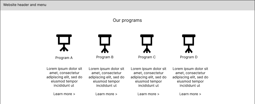
B. May require a net-new page to be created on the site to accommodate it. Consider the use case of showing program details. Figure 5 uses a modal for this purpose. However, the design in Figure 15 links to a newly-created page to provide the details of each program.
3. Using other less disruptive means of progressive disclosure
Use alternativemeans of progressive disclosure on the parent page to reveal additional content. These include accordions, pop-up tips, tabs and drop-down menus.
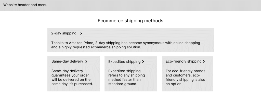
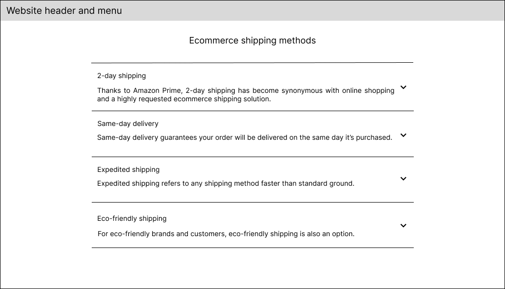
Consider the use case of showing a one-sentence definition for each shipping method on the page. Figure 16.a uses modals to provide further explanation on shipping methods. Figure 16.b uses accordions for the same purpose.
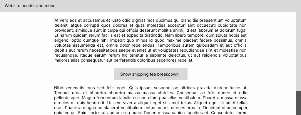
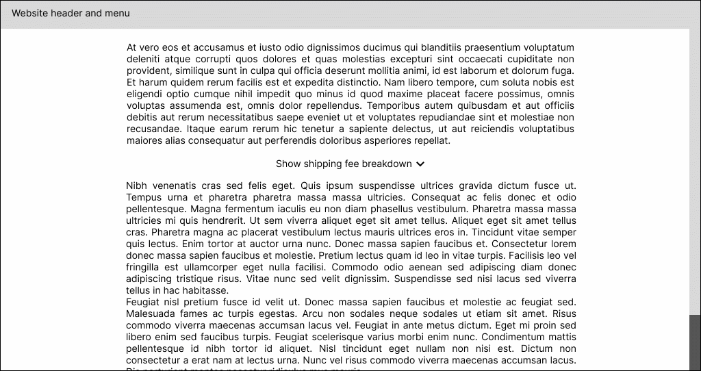
Figures 17.a and 17.b are two ways of showing the shipping fee breakdown table, one using a modal and the other using the “show more” construct.
By using alternative means of progressive disclosure, Figure 18 shows a way of redesigning the use case in Figure 4 using a pop-up tip.
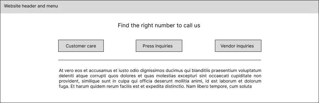
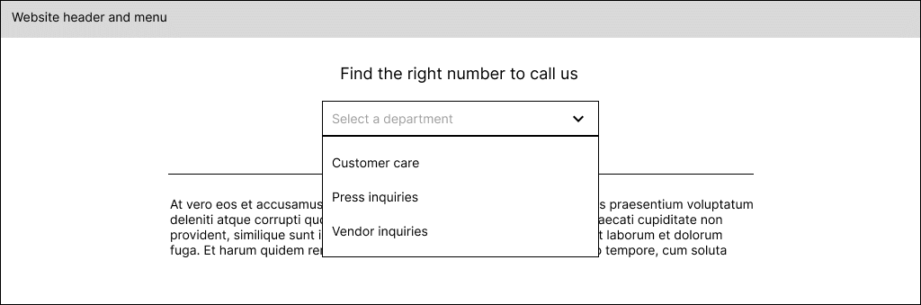
Consider the use case of directing users to the right number that they can call depending on their inquiry type. Figure 19.a uses modals to show the phone numbers. Figure 19.b uses a dropdown for this purpose.
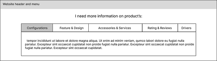
Consider the use case of showing additional information on different aspects of a product. Figure 20.a uses modals to show this additional information. Figure 20.b uses tabs for this purpose.

Alternative to Video Modals:
Playing the video inline on the page
The benefit of this approach is that it allows users to scroll up and down the current page and skim through its content as the video is being downloaded. This is especially important if the video takes a while to download. It also enables users to listen to the video in the background as they are reading through the page’s content.
As an alternative to the modal in Figure 6, Figure 21 shows an example of playing the video inline on the current page.
Alternative to Form Submission Feedback Modals:
Presenting form submission feedback on a separate page
This alternative uses a net-new page to display important information such as an inquiry number to a user after they fill in a form and submit it. Figure 22 shows an alternative way of redesigning the use case in Figure 7 by creating a net-new page.
Solution space — convergence
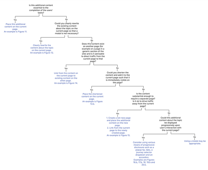
To help UX designers decide between using user-initiated modals vs. alternatives, we created the Modals Decision Framework (MDF). We are not recommending that modals be phased out entirely, but that they be used less often when no preferable option is available.
The purpose of the MDF is 1. to connect the current use cases for modals on the audited site to alternative means where appropriate, 2. to identify the most effective scenarios for using modals. The recommendations in the MDF are based on the guidelines and best practices suggested by UX literature and various design systems such as IBM’s Carbon Design System.
The MDF is structured conversationally to engage designers in a dialog consisting of a series of questions asked in order of logical precedence. The purpose of these questions is to better understand the context of the problem that the designer is dealing with before making a recommendation. In the MDF, the questions that look into the specifics of the problem that the designer is trying to solve are in black and the recommended solutions are in blue. To help designers apply these recommendations, solution nodes reference relevant examples from this story.
To keep the MDF at a legible size within Medium’s width constraints, I’ve split it into three based on the category of use cases identified for modals on the audited site today. It is best to read through these three parts in the order presented in this story. The original one-piece version of the MDF could be accessed at:
Part 1 of the MDF — for Basic Modals
If the answer to the question “Are you considering using a modal to display additional content about a topic on the current page?” is yes, then this branch of the MDF will be useful to you.
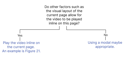
Part 2 of the MDF — for Video Modals
If the answer to the question “Are you thinking of using a modal for playing a video that has a play button on the current page?” is yes, then this branch of the MDF will be useful to you.
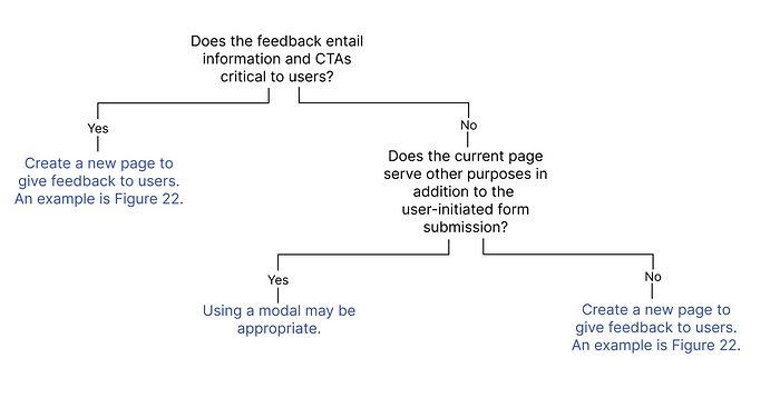
Part 3 of the MDF — for Form Submission Feedback Modals
If the answer to the question “Are you thinking of using a modal to give feedback to users about the result of a user-initiated form submission on the current page?” is yes, then this branch of the MDF will be useful to you.
The MDF has been specifically designed to address the needs of the audited website and the business it needs to support. The use cases considered reflect how modals are currently used across the site and the use cases that are likely to occur based on the precedents observed. For example, one of the common use cases for modals in UX literature is to ask for confirmation when a user requests a record to be deleted. As no transactions are happening on this website based on the business that it needs to support today, these modals are not considered in the MDF. However, the MDF is scalable and new use cases could easily be added as they arise.
In suggesting a holistic solution, here are additional recommendations based on the problems identified on this website:
Visual design and content strategy guidelines
- The (i) icon should be reserved for pop-up tips while modals should be opened when users click on buttons and links.
- Although titles are an optional part of modal anatomy, we recommend they should be added to modals on this site to help set context for users.
- CTAs should only be placed in the footer area of modals.
- Modal content should be concise with guardrails. For example, Telus’ Design System recommends 150 characters for titles and 400 characters for body text.
- The maximum width of modals should be 90% of the screen up to 600px. The maximum height of a modal should be 80% of the screen. Vertical scroll bars should be added to modals when viewport height is shorter than the contents of the modal.
Development guidelines
The development method should change so that when new modals are added to the website, they become part of the parent page’s source code. This would better leverage the SEO benefits of the content in modals by directing Google search traffic to the parent pages. This is a special point of consideration when it comes to Basic Modals.
This is not an exhaustive list of all modal guidelines. For example, the accessibility guidelines related to modals are not mentioned because they are not violated on the audited site. This story does not touch upon all content and visual design guidelines either. It only focuses on the ones that could be better applied to this site.
Conclusion
In many cases, the usage of modals on this site is indicative of design problems. More often than not, they have been used on the audited website to make life easier for the designers rather than users. Rather than phasing modals out, we suggest they should be used properly only when required.
This MDF is an attempt to limit the use of user-initiated modals to cases where they are absolutely necessary and recommend alternatives based on factors that can impact the decision-making process. It may not fit your specific design-space requirements. However, it is an attempt to steer designers towards their best design alternatives.
I’d like to thank my collaborators, Hossein Sharafi, Masoud Jahani and khadijeh Hamidi for their valuable contributions to this story.